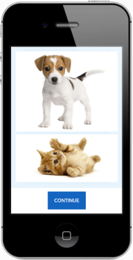
Responsive Image Tips & Troubleshooting
 Building your form to be responsive on mobile devices is easy with Formsite, but sometimes adding a responsive image can be tricky. There are a couple of ways to add images using your Form Editor and each method uses the same underlying code to display them correctly, and when that code is incorrect you can see problems like:
- Too big or too small images
- Out-of-proportion images (stretched or squished)
- Blurry images
Add images to your form
Formsite account holders with paid services can use the User menu -> Files & Images area to upload and store their form’s images, and Free account holders can use any number of online services to locate images for their form. See our previous post for tips on using other online sources for your images.
Once you have your image’s URL, you can use any of the image items (Image, Image List, Formatted Text, etc.) to add it to your form.
Make your image responsive
The key to making your image mobile-friendly (or responsive) is to understand how the image is displayed. Essentially, images are added to your form using the basic HTML structure:
<img src="https://image-url">
The tricky part occurs when trying to size the image because the specific height and width need to respond to the size of the display (hence, ‘responsive’).
Since every device is almost always guaranteed to be slightly different each time, using a specific width or height is incorrect. That will look correct on some devices but not all.
The answer, therefore, is to use a fluid width — in this case a percentage — to display your image. Since you can’t simply tell it to be 100% wide at all times, you also need to limit its maximum size, like so:
<img src="https://image-url" style="width: 100%; max-width: 123px; height: auto;">
Formsite how-to
Using the Image item is the easiest way to add a responsive image to your form.
- Add an Image item to your form
- Select your image if it’s in your Files & Images area, otherwise click the Upload Files button (for paid accounts) or paste your image’s URL
- Leave the height and width parameters blank
Test your form by clicking the View Form button and resizing your browser, or view on your mobile device to verify the responsive image.
Using the Text editor (Formatted Text, Header/Footer, Success Page, etc.) is also possible because you can easily see the exact code that the item adds.
- Add your Formatted Text item to your form
- Click the image button and paste your image URL, then click Ok
- Click the source code button to see your code
Your image code will look similar to:
<div><img src="https://fs18.formsite.com/alex001/images/download.jpg" width="508" height="496" /></div>
To make your image responsive, change the code to use our special style code:
<div><img src="https://fs18.formsite.com/alex001/images/download.jpg" style="width: 100%; max-width: 508px; height: auto;" /></div>
Troubleshooting
- If your image stays tall but the width changes when you resize your browser window, your image does not have the height: auto setting.
- If your image is blurry and too wide, your code does not have the max-width setting.
Questions? Leave a comment and we’ll be happy to help.