Progress Bar, Page Numbers & Custom Indicators
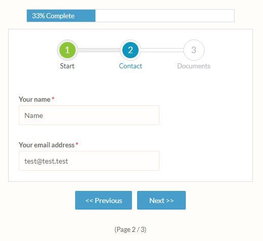
Forms and surveys with many items can benefit from splitting the form into multiple pages. The user experience is better when the form visitor is presented with the questions as needed rather than the entire form at once. Showing the visitor’s position in the form is done using the progress bar and/or page numbers, and form owners can make custom progress indicators, too.
In order to display the progress bar and page numbers, there needs to be more than one page in the form. Adding pages is done in the Form Editor by inserting Page Break items where they’re needed. Once the form has multiple pages, the progress indicators can be used.
Progress Bar
The settings are located in the Form Editor -> Style page under the Customize tab. The available settings are:
- Progress Bar: Hide and Show
- Progress Bar Color: Choose the color of the bar behind the text
The bar text is always white to show the most contrast with a dark bar color.
How it works:
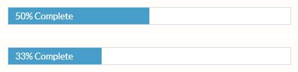
If the bar is set to show and the form has more than 1 page, it will show the percentage complete on all pages after the first. Examples:
- 2 page form, page 2: 50% complete
- 3 page form, page 2: 33% complete
- 10 page form, page 6: 50% complete
Why doesn’t page 6 show as 60%? Because when the visitor reaches page 6, that means that page 5 is complete, or 50%.
Page Numbers
The page numbers setting is located immediately after the progress bar settings in the Form Editor -> Style page under the Customize tab.
- Page Numbers: Hide and Show
- Header/Footer Text Color: Choose the color of the Header/Footer and Page Numbers text
Custom Progress Indicators
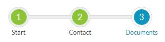
The easiest way to add custom progress indicators is by adding a Custom Code item to the top of each page, then add the CSS and HTML to customize each page.
For example:
<style>

.progress{width:100%;margin:20px auto;text-align:center}

.progress .circle,.progress .bar{position:relative;display:inline-block;background:#fff;width:40px;height:40px;border-radius:40px;border:1px solid #d5d5da}

.progress .circle:not(:last-child){margin-right:80px;}

.progress .bar{position:absolute;width:85px;height:6px;top:16px;left:40px;border-left:none;border-right:none;border-radius:0}

.progress .circle .label{display:inline-block;width:32px;height:32px;line-height:32px;border-radius:32px;margin-top:4px;color:#b5b5ba;font-size:17px}

.progress .circle .title{display:block;color:#b5b5ba;font-size:13px;line-height:30px;width:200px;margin-left:-80px;text-align:center}

.progress .done .bar,.progress .circle.done{background:#eee}

.progress .circle.done .label{color:#FFF;background:#8bc435}

.progress .circle.done .title{color:#444}

.progress .circle.active .label{color:#FFF;background:#0c95be}

.progress .circle.active .title{color:#0c95be}

</style>

<div class="progress">

<div class="circle done"> <!--add the 'done' class for completed steps-->

<span class="label">1</span> <!--step number-->

<span class="title">Start</span> <!--step title-->

<span class="bar"></span>

</div>

<div class="circle active"> <!--add the 'active' class for the current step-->

<span class="label">2</span>

<span class="title">Contact</span>

<span class="bar"></span>

</div>

<div class="circle"> <!--no added class for future steps-->

<span class="label">3</span>

<span class="title">Documents</span>

</div>

</div>
If you’re not comfortable with CSS and HTML code, another way to add the progress indicators to every page is by creating custom images and adding them to the top of each page with Image items.