Field Labels in Forms Affect UX & Completion Rates
Using Formsite’s drag-and-drop form builder makes for fast and easy forms. Adding form items provides the item’s structure automatically, and some options are available for more customization. For example, the default position of the field labels places them above and aligned to the left side of the field. For most forms (in left-to-right reading languages), this default placement proves to be the best.
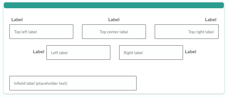
Placement of Field Labels
The possible label placements are:
- Top left, center, or right
- Left, right
- Infield (inside the field)

Best: Top Labels
 Top left labels provide the best readability and fastest scanning for the majority of forms. Top center rarely appears and only works in special cases when the label’s size matches the field’s size. Right labels appear mostly with rtl (right-to-left) languages and when setting the form alignment to the right.
The top left label gives the form visitor a visual anchor where the item begins, and makes reviewing the form before submitting much easier. Field labels located away from the fields do not have the same benefits.
Runner-up: Left/Right Labels
 Left labels (right labels for right-to-left languages) offer the next-best option, but only in certain circumstances. As field labels they work fine with text fields, but multi-select items like radio buttons, checkboxes, and dropdown lists do not work as well with left labels. For short forms or those with acceptable space between the items, however, form visitors can surely work them out. With that in mind, left (or right) labels slow down the form visitor and cause the visitor to take more time when completing the form.
Bad: Infield Labels
Form labels that appear inside the field itself must be avoided. The placeholder text offers form designers a tidy place to display the label, but doing so causes problems like:
- The label disappears when the visitor enters the answer
- The labels are not visible when reviewing the form
- There is no comparable label position for multi-select items, so consistency suffers

Placeholder Text
The fields’ placeholder text serves a specific purpose: To provide additional instructions when completing the field. The intended uses for placeholder text includes displaying instructions and examples of properly-formatted answers.
Helpful text examples include:
- Date formats (10/5/2018 or 2018-10-05)
- Website URL formats (example.com or https://www.example.com)
- Name formats (Last, First or First Last)