New Input Styles! Updated Radio Buttons & Checkboxes
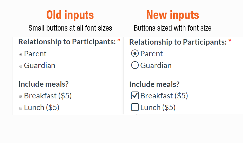
Formsite forms have gotten a style update! Radio buttons and checkboxes now use custom vector images instead of the browser’s built-in input styles. These new input styles allow us to display a consistent appearance across all system and browser types. Also, mobile and other touch-enabled devices can scale the display to see sharp inputs at all sizes.

New Input Styles
The new styles replace the browser’s HTML form elements with custom vector images. These images display the same across all operating systems and browsers. This helps form owners know exactly how the forms will appear to all users.

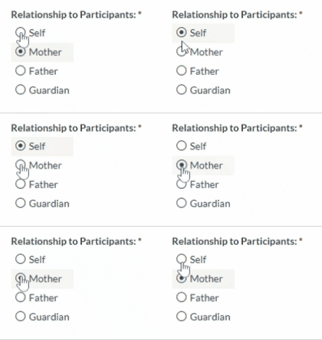
Besides to the icon display, there is now a small animation added when selecting options. This animation helps to make the choice selection more impactful for the user, especially on mobile devices. Mobile users will also find larger target areas for selecting inputs to enhance usability.
How to Implement
The new inputs appear in all new forms and convert when editing existing forms. Current forms are not modified until the form owner edits the form. Form owners that wish to upgrade existing forms need to log in and edit the form, then the form will automatically switch to the new input styles.
How to Customize
The new inputs use the same color as the form’s text and use the font size for sizing. This strategy shows large inputs when the text is large and small inputs for small text.
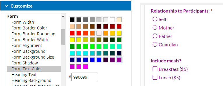
Changing the font color and the radio button or checkbox color:

- Go to the form editor
- Click the Style link, then click Customize
- Locate the Form Text Color setting under the Form area
- Select a new color or enter the hex code into the color box
- Verify the color is correct in the preview
- Click Save
Changing the font size to increase the text and input size:

- Go to the form editor
- Click the Style link, then click Customize
- Locate the Font Size setting under the Page area
- Select a new size and verify in the preview
- Click Save