Form Optimization for More Results & Conversions
 Do you have an order form or lead generation form that you want to get more results? Conversion optimization is a recently coined term that essentially means making your form or web page as easy as possible for visitors to complete your ideal goal.
Whether your ideal goal is to get orders, leads, or any other information, the fundamental concept is selling the form visitor on completing your form.
Make it look good
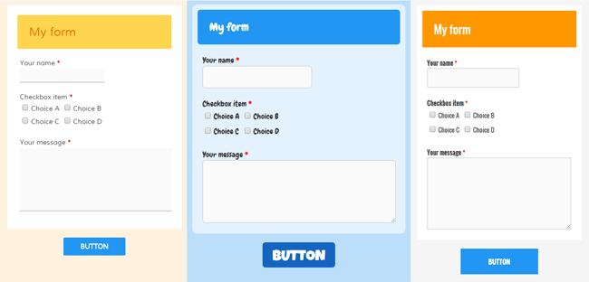
Your online form needs to look good right off the bat or you risk losing visitors to an unattractive form. Things like non-responsive forms on mobile devices or unreadable fonts are common pitfalls of old, poorly designed forms.
Luckily Formsite has built-in styles and themes that can turn any old form into a modern, professionally-designed one. If you are looking to customize your forms beyond the pre-made styles, click the Customize tab in the Look & Feel settings to adjust everything from the page background and form width to the item spacing and button font. Customizing your form style to match your personal brand and topic helps to communicate your form’s value to the visitor, which increases the likelihood of conversion.


Optimization for your forms includes looking good on all devices. All new Formsite forms are responsive by default and old forms can be switched easily by going to Look & Feel, clicking the Advanced/CSS tab, and checking the setting.
Item optimization
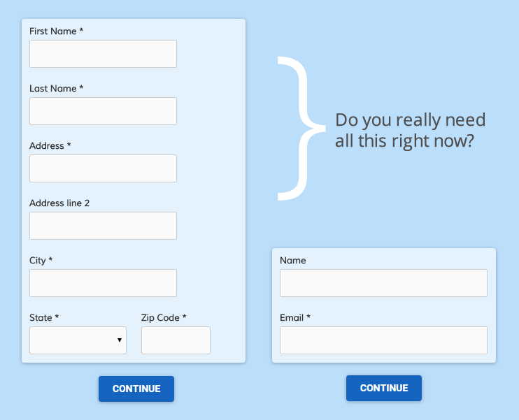
Choosing the right item is an important part of helping the visitor easily complete the form. An easy example is whether to use two fields to collect first and last name or a single ‘Name’ field. Other examples include:
- Use radio buttons or dropdowns when the choice is limited to one and checkboxes for one or more
- Use a Text Quantity item before your product to allow for ordering multiples
- Apply rules to hide/show questions based on previous answers
If your goal is to collect as much visitor information as possible, consider where in your form you ask for the information. Asking for too much too soon is a common reason for visitors to abandon a form, so ask for the bare minimum at the beginning. Once they have spent more time on your form then follow up with additional questions. It’s human nature to not want to lose their invested time so you are more likely to get that information later.

Show that you care
 Security and credibility are of paramount importance when collecting personal information online, so take steps to protect your brand at all costs. Formsite has embraced online security through expanding their secure forms over all forms at all levels by default and free of charge. You can help to communicate this by using the “Secured by Formsite” badge on your form, which is enabled under Form -> Configure -> Security.
Credibility is displayed in a few ways, such as the time taken to customize your form with your organization’s logo and/or style. Other ways of increasing credibility include providing your privacy policy, shipping and return policies (for order forms), and instructions on how to contact you with questions or problems.