Responsive Forms Builder
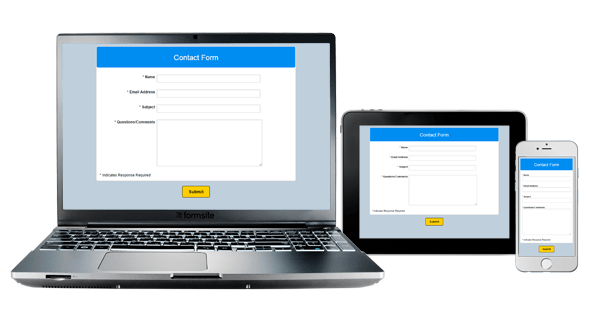
 Formsite forms are now fully responsive, which means that you can build your form to be optimized for devices with different display sizes. Completing a form on a full-size desktop or laptop computer is much different than completing it on a tablet or smartphone. Our responsive forms builder automatically makes your Formsite forms change for the best possible experience on the device you’re using.
To repeat: This setting is automatic for all Formsite forms. You do not need to do anything to enable responsive forms.
How responsive forms work
We use media queries in the code to detect the screen size, which loads the necessary styles for those kinds of devices. The styles adjust the size and display of various form items to meet the unique needs for each device. For example, the desktop/laptop styles will show the form fields and buttons normally, while the smartphone styles will maximize the field sizes to make it easier to see and complete.
Responsive Forms Builder for Embedded Forms
Embedded forms are a fast and easy way to add forms to your site using our provided embed code. A common technique is to insert a box into a portion of the page and paste the embed code into the box, creating a contact form or signup form.
In this example, embedding the form into a small area will trigger the responsive code and may result in unexpected styles for some form elements. We have created a new parameter for our embed code that allows for enabling or disabling the responsive styling. For more information, see our documentation page on Embedding Forms.
Modifying the responsive styles
Advanced users may have a need to modify the styles for the various device sizes. We have added detailed instructions for adding custom styles to the documentation page for Responsive Forms. Updating the different sizes in our responsive forms builder is as easy as going to the Advanced/CSS page and adding your custom CSS.
As always, we welcome questions and comments about our services at our support contact page.